York Lions Rebrand

Signage, Print/Digital Assets, Social Media
Timeline

2018

Tools

Illustrator, Photoshop, InDesign

Role

Graphic Designer - York Lions Rebrand

York Lions Rebrand
I assisted the York Lions Athletics & Recreation, Marketing & Communications team as the lead student graphic designer for the rebrand project. I directly supported the Marketing & Communications Manager by creating and designing mockups for the rebrand project while adhering to the new brand guidelines. Once the rebrand was completed and successfully executed I was asked to come back in September as a student graphic designer to continue my work with the York Lions. Since I spent the summer learning how to apply the new branding to promotional materials I was able to complete day-to-day tasks with ease and in a timely manner, while simultaneously completing my bachelor's degree in design at York University and Sheridan College.
My Experience
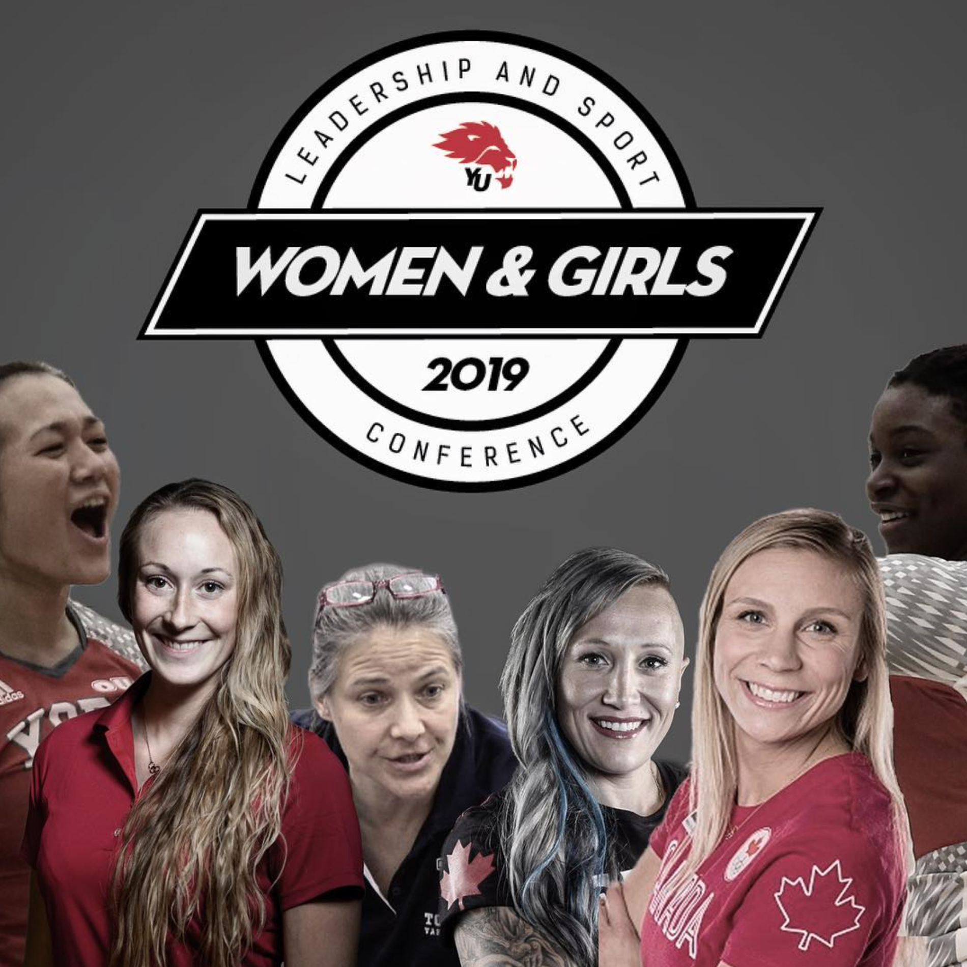
In 2018, York University rebranded their Varsity Athletics (York Lions) from the old logo to a brand new one with updated brand guidelines. I was hired to assist in the roll out of this new identity and branding to all York Lions digital and printed materials during the summer before all students returned to campus in September. This role allowed me to complete tasks efficiently, confidentially, and solve challenges creatively while applying the new logo and typeface to preexisting signs, scoreboards, banners, flyers, social media posts and the yorkulions.ca website.
Alumni Field Press Box Banner
York Lions Athletics
2018
Updating the Alumni Field Press Box Banner was a break through moment for me and the marketing department during the rebrand process. The task was to create an updated banner which included the new YU logo along with the words 'York Lions'. The challenge was that they wanted the background of the sign to be red (to match the press box) but they also wanted to use the primary logo (red lion head and black YU). As I was creating the mockups for the banner I had the idea of adding a white box behind the logo that is slightly slanted to match the typeface used and the logo which has a forward facing lion head (signifying forward movement and looking ahead to the future of varsity sports). This white slanted parallelogram was the perfect solution and subsequently used on many other signs and applications as it fit well into the existing brand guidelines and conceptual design choices already made during the rebrand.
Original Sign
Tait McKenzie Centre Entrance Sign
York Lions Athletics
2018
The first thing people see when they walk into the gym at York University is the entrance sign. This sign is the same layout and format as the original one with updated logo and typefaces.
Original Sign
Tait McKenzie Centre Varsity Gym Doors
York Lions Athletics
2018
The main gym doors are the entrance that all varsity athletes and spectators walk through when going to see a basketball or volleyball game at York. This is also where some intramural sports and events are held on campus. The goal of this project was to make the logo and type look distressed and a bit rugged to show the grit and determination of the York Lions.
York Lions Instagram Posts
York Lions Athletics
2018 - 2021
Throughout my time with the York Lions I assisted in the creation of social media posts. This included researching current trends in sports photography and poster designs, cutting out athletes to create collages, and creating a well balanced yet dynamic, eye-catching compositions.
Other Projects